I'm currently playing with working from loose to detail, from abstract to realism, from chaos to order. This is a selection of a few paintings I started in my art classes and where they are right now. I might leave them as they are, or continue to tickle them with my paintbrush!

Taz - a staffie in pastel


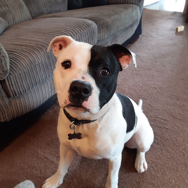

I am recording the making of this pastel portrait so I can speed it up and put it on YouTube - the challenge is two-fold! The owners of Taz commissioned me to paint a portrait of their previous dog, Sophie, about ten years ago and have very kindly come back to me. I haven’t taken as many photos of the process as usual but this is Taz so far… nearly there but a bit of balancing needs to happen before the final whiskers go in! I’ll put a link to the video when it’s been edited and uploaded.

Ella & Josh abstract pastel
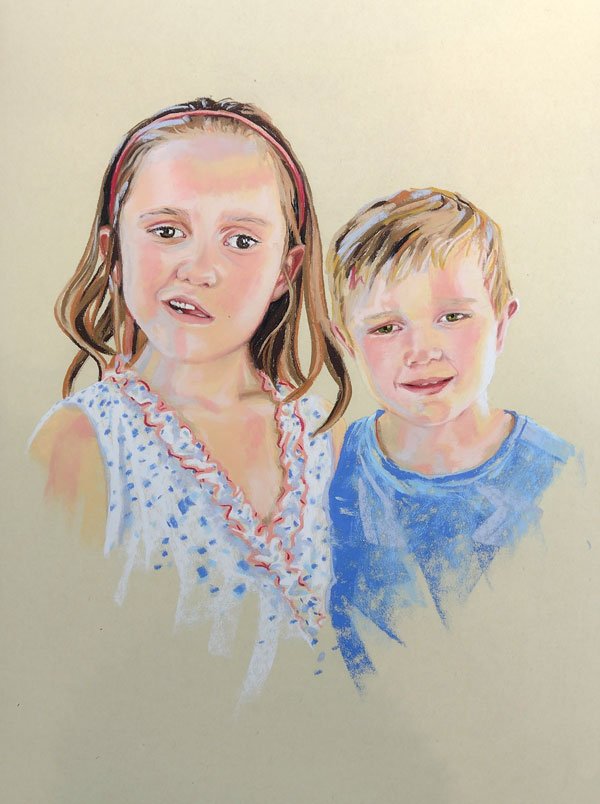
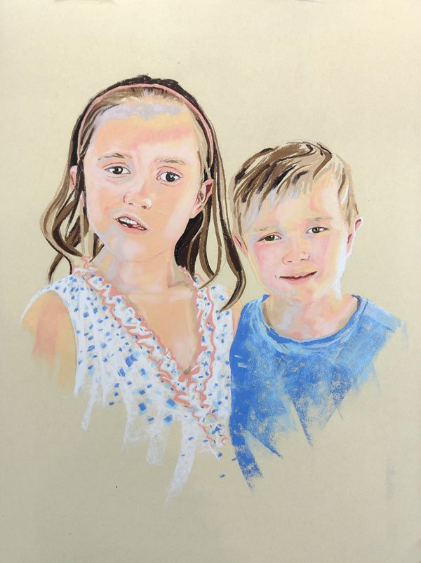
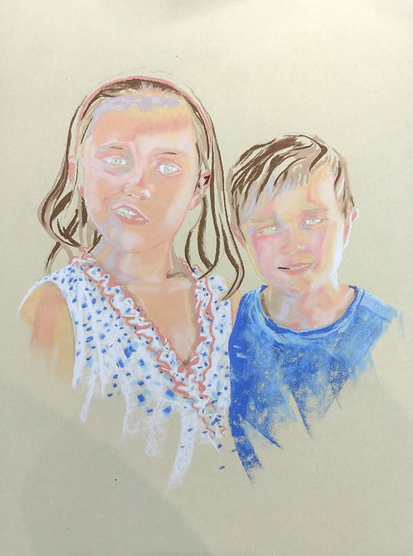


I met Ella & Josh with their grandparents in Arundel this summer to take a photoshoot - funny story, but one for another day…! Anyway, we talked a little about preferred styles of art and decided, as this joint portrait is a surprise for their daughter’s birthday, that I would work along the lines that the parents enjoy modern graffiti art. Children are always some of the hardest subjects to paint as they have very delicate skin tones and their life story hasn’t yet been etched onto their faces so a strong graphic, Pop Art approach doesn’t always work. I created a few sketches, combined the expressions of two photos, played about with some compositions and decided a slightly squarer option would work best. So after pulling their faces closer together I pushed some guidelines onto Fisher 400 pastel paper… this is a really rough paper - it eats your pastels - but I like it for loose and expressionistic strokes and chose it as I don’t want to blend the colours as I would with other styles or on less ‘toothy’ grounds. I selected a few warm skin tone colours first and blocked a few in, then added small areas of white for my lightest contrast. Often, I like to put the darkest darks in next but as the skin tones need to visually blend without any smudging and the marks need to be kept pure, I opted to stay with similar tones but different hues. The purple was much more of a contrast than anticipated when placed next to the other flesh colours and the darker pink needed toning down. As soon as I started to put the lighter hair colour in it started to make a bit more sense but it was at this stage I decided to move away from the faces and put in some bolder marks. By working on the clothing I could start to play with texture, shape and tone in a more deliberate manner and take the emphasis away from the stark mark-making on their faces. I only met Josh and Ella for a short time and although it was quite eventful, I wanted to get a sense of their personalities in the portrait. They were shy, having first met me, but I sensed they were thoughtful, kind, not boisterous… There’s still a way to go, a lot of staring, walking away and tweaking to get the balance right without over-working it but I think I’m winning…
How to gesso a wooden panel in preparation for painting
This video shows you how to prepare a wooden board in readiness for painting with either acrylics or oils, using gesso. Gesso is a primer that creates a barrier between the surface and the painting so that nothing can leach through to ruin your masterpiece. Gesso is usually available in white but also comes in black... so the first coat I apply to the board is black, the second coat is white and the third coat I mix together on the board to make grey. You can use any wide, flat brush to apply the coats of gesso and lightly sand between layers. I usually wait 24 hours before starting my painting to ensure the gesso is fully dried. I make sure I clean out my brush thoroughly in warm, soapy water after each coat.

A cat called Arlo in pastel


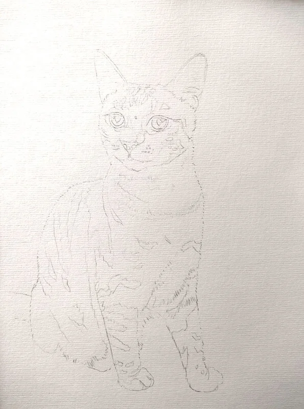
This lovely puddy has been on my easel for a while and is nearly finished. I’m putting up the initial stages of the drawing where I have sketched the shape and transferred it onto Ingres Pastel Paper to match a previous commission I did for the owners. It’s a pastel portrait in a similar style and the same size as their silver tabby. First off I blocked in the light areas, which don’t really show as the paper is light, followed by the dark markings. Then I focused on looking at the colours in the eyes and shadows on the coat. These layers have been lightly blended but I want to keep the mark making fresh so most of the blending is being done with the next layer of pastel. I’m using Faber-Castell pencil pastels with a silicon blending tool. I’ll be putting up more photos soon so keep an eye out!


Pippin - dog portrait in pastel


This latest portrait is of Pippin with the remarkable blue eye. It’s a small headshot - 6 x 9” - and is to complement another portrait I did for the owner back in 2012 of Ben. I chose the same colour Ingres Pastel Paper and decided first of all to straighten the head. Usually I quite like a tilt but it would have looked weird next to the portrait of Ben so I sketched the basic shapes before blocking in the main tonal colours. I focused on the tongue and other bright and intense acres - this was done using soft pastels and Conte pastels. I haven’t shown many of the stages when I switched to using pastel pencils as, with smaller portraits, the shifts are so subtle in tone, texture and hue variation, you can’t really notice much difference. However, these small alterations make all the difference in building up texture, shine, depth and colour in the coat. Finally, the whiskers go on which are the fine details you can see.

Sue with margarita and giraffe
This fun and challenging portrait commission hails from America and incorporates a number of ideas very helpfully collected together on a couple of ‘mood boards’. I started playing around with the elements of the central figure sitting or lying on a teal chaise longue, holding a margarita cocktail with a giraffe looking over her shoulder...!! A bee cushion was introduced before transferring the sketch to a Belle Arti linen art canvas which I had pre-primed with a cream coloured gesso. Next, I started blocking in the main colours with acrylic paints. It may be because it’s a little colder in my studio at the moment but as I was working the paint layers were continuing to misbehave and go streaky. I decided to switch to oils so the glazes worked much better and a lot of detailed work, especially on Sue’s face, was painted in with tiny brushes. We decided to put her hair up which is super curly and fun! I think I’ve got her…


Sussex landscape photographs for inspiration...
I have loved the autumn colours this year and on woodland walks have enjoyed writing poetry and getting my paints out to create a few scenes back in my studio. Often I take photos on my phone to capture the light but they don’t have the quality a professional camera can capture so I’m always on the lookout for quality, atmospheric shots. Fortunately, this year, my husband Chester has taken up photography again and has taken some beautiful shots… often getting up early in the morning when the forecast mentions fog or mist to chase that elusive light in various parts of the Sussex countryside. Check out his website links below…

Misty morning shots of the South Downs: https://www.chestertugwellphotography.com/images/south-downs-national-park
Woodland Shots: https://www.chestertugwellphotography.com/images/surrey
Arun Valley Shots: https://www.chestertugwellphotography.com/blog/mist-in-the-arun-valley
Home page link: https://www.chestertugwellphotography.com
Blog page link: https://www.chestertugwellphotography.com/blog

Buster - pastel of a black & white cat

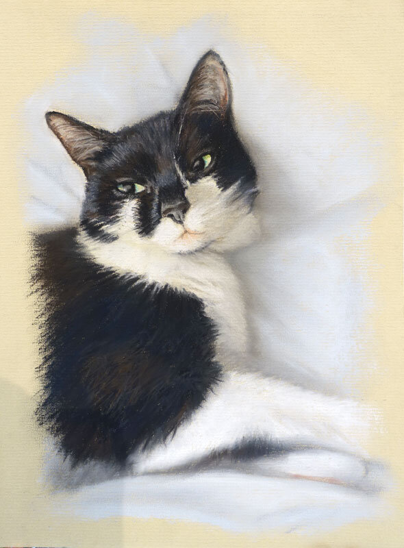


This is Buster, a black and white cat with a very cute pink mouth which is being painted in pastel on A4 Daler Rowney Ingres Pastel Paper. I’ve been discussing backgrounds - whether Buster would look best in foliage or as this pose, sprawled on bedsheets. The stripes may prove to be too distracting to the portrait overall so I’m developing the background alongside the rest of the portrait. I started by drawing the outline of the cat onto pastel paper before blocking in the cool and warm hues I could see within the black coat and blending them together. Blacks and greys were added over the top to establish the tonal shapes and shines. Next I tackled hues within the white of the fur which included peach and cream hues in the light areas and bluey greys in the shadows. These were blended with white, at which point I decided to put some of the shadows and folds of the bedclothes around the cat to make him look snuggly and define the edge of his white chest. More layers of colours followed - black and white was applied with pastel pencils in more specific and detailed areas to sharpen the important edges. Then I decided to tackle the background before doing too much fur around the edges and used light blue, grey and white pastel Conté pastels. Initially I quite liked the texture created by the Ingres paper but decided a softer approach was needed so blended everything together to make Buster look snuggly! There’s a lot of work that went into the last two stages but nothing much appears to change on the photos as it’s a case of building and correcting tonal values, shifting shapes, putting tiny hairs and other details with sharp pastel pencils, and softening and punching out colour, so I tend not to take many pics. Lastly I put a mount around it to see how the edges work. I need to check everything in the daylight again, sign it and hope they like it!

Betty - pastel of a black lab


This is Betty - a lovely black lab who looks as if she’s had a lot of fun in water somewhere. So my challenge was to paint a detailed pastel portrait, the same size and style of a previous commission. Black animals are often the trickiest to get right as black is such a dull colour to work with but I loved the shine on Betty’s coat and began with a sketch to figure out the shapes of the highlights and shadows. Then I transferred the sketch to Daler Rowney Ingres Pastel Paper, ensuring the grain ran the same way as the previous portrait and matched the paper colour too. I used a few hard pastel sticks of blue, white and black to block in and reserve areas of mid, light and dark tonal areas respectively. I quickly moved to using pastel pencils as the image is so detailed and the size is 9 x 12”. I used dark blue and brown in the shadows to keep the black looking lively before reinforcing the darkest areas with black. The basic shapes were blended using a cone-shaped silicon blender - always moving in the direction of the growth of fur. Lights and darks were re-established before various blues and greys were added to blend between the two extremes and this process was repeated a few times, always ensuring the basic shapes were maintained. After carefully blending the final layer in parts, stronger ticks and marks were placed to highlight the wet fur and deepen the darkest areas. These were kept sharp and unblended but were used to break up some of the larger shapes. I decided to hint at a background of stone using the same colours as I used in the dog’s coat along with a hint of sap green. I may come back and tweak a few shapes before putting it in a frame so I’ll stare a while longer…

Warney Mill - An adapted pen drawing


This drawing of Warney Mill is destined for a book cover. The image is an artists’ impression of how the mill used to look based on old and recent photographs, some floorplans and a lot of sleuthing by the author. My original detailed pencil sketches included the top windows, which wouldn’t have been there, and other details I’d drawn in that weren’t relevant. After making the changes I tested the size of pen nib needed in order for the reduction from A3 to work when printed. I chose a 0.2 Unipin fineline and tentatively put in the details although this felt like quite a thick nib for the amount of detail I needed to add. However it needs to translate well on the print press. I drew the trees and some of the background to give the building some context and edges, darkened up the slate roof areas and added a plethora of dashes and dots to suggest stone walls. At t that point I checked I was on the right lines before darkening everything up as it’s easier to put pen marks in than take them out! By finishing the doorway, adding a suggestion of grass for the foreground and circling some clouds in the sky I could then see how much additional detail I needed to finish off the drawing. I have deliberately kept the building light so needed to darken up the tree and background areas to help it stand out more. I also stippled a number of dots to suggest the path ad add subtle detail where needed.

Willow - cat portrait in acrylic


This is the start of a portrait Willow who is destined to join her friends Eddie and Jess on the red wall of fame. I started by cropping all he various photos to see which one might work best on a 12 x 16” box canvas and decided the one of her showing her tummy might work best. I sketched a detailed drawing of all her markings and moved her tail to a different position so it wouldn’t go off the canvas and would curl around her a bit. Then, using a mix of payne’s grey, mars black and a bit of yellow ochre the cast shadows were painted in with a big brush, followed by the darker markings using a fine brush. White was mixed with blues, purples and greys to form the shadows on areas of white fur and a few of the mid-tones were added. This was left to dry before the background colour was painted over the shadows, around the cat and down the deep edges of the canvas. This colour was tricky to mix as I want to match it to the other portraits previously painted, to tie them all together as I can’t remember exactly what I used. I will probably rebalance this later on but I wanted to see how this would affect the colour of Willow’s coat. Next, I mixed a variety of cool and warm browns and greys and applied them as washes over the tabby markings, leaving some layers to dry and others to merge. The last two images show the most work but not a lot appears to change or is terribly apparent in photographs as layers of different colours and tones are applied with small brushes to build up the depth and density of the coat. I also deepened up the cast shadows and played with the background with a big brush, which took less time and gave me a break from the detail. I’m nearly finished… I just need to balance the lights and darks and paint those all-important whiskers!

Ted and Frodo - Double Pastel Portrait


This double pastel portrait is another Christmas commission which was quite a tricky composition. I did a number of sketches and played around with the images of the horse and pug on my computer, based on the photos supplied, before creating a pencil sketch to the right size on tracing paper. When all the workings were complete, I transferred this image onto Fisher 400 Pastel Paper. This is an extremely tough and ‘toothy’ pastel paper which can take paint as well as pastel. For the background I mixed up a variety of blue watercolour pigments and paynes grey and painted the background in a diagonal direction with plenty of water. I tried not to lose my original drawing but made sure the background overlapped onto the animals. Whilst the painting was still wet I applied soft pastel, sprayed it with water and let the pigments drip through at an angle to create a textured finish. This was left to dry before the blocking in process started. I have used a variety of Daler Rowney, Conte and Unison Pastel sticks for the base and then moved onto Faber Castell Pitt Pencils for the details. This is now being built in the final layers with fine flicks of pastel to show individual hairs and details on the coat.
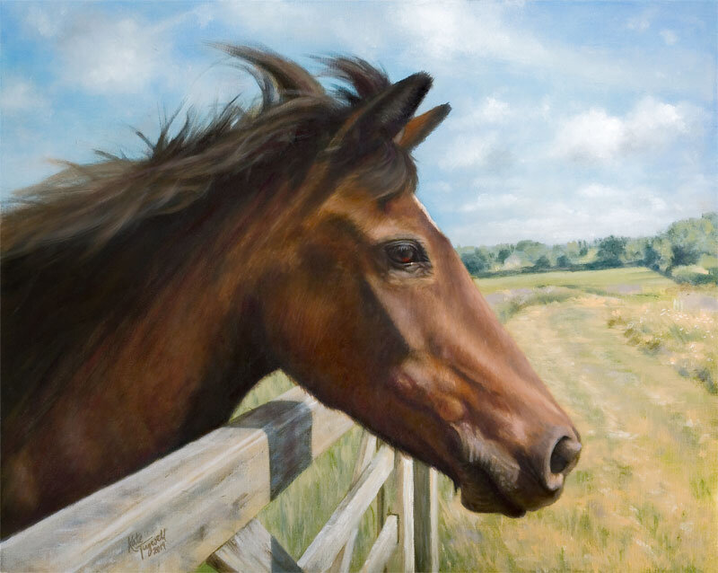
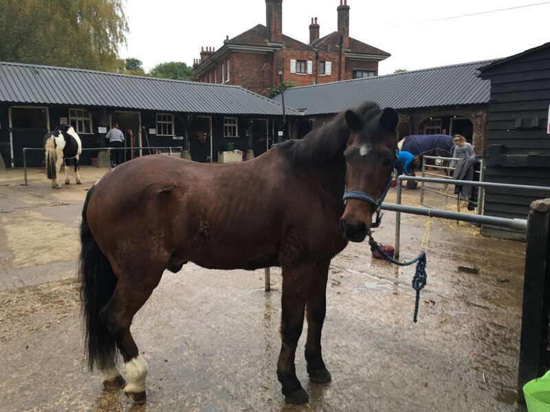
Brandy - Horse Portrait in Oil

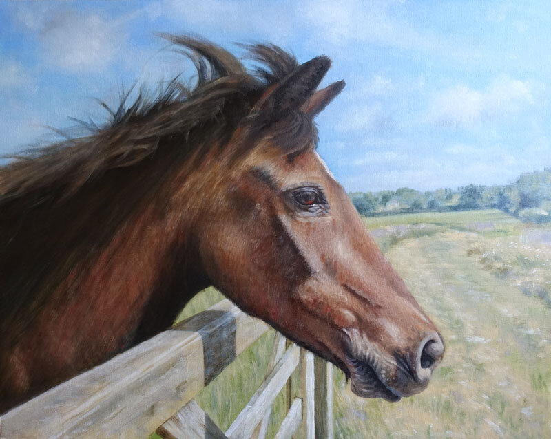

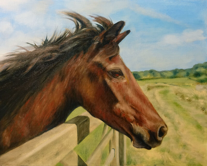
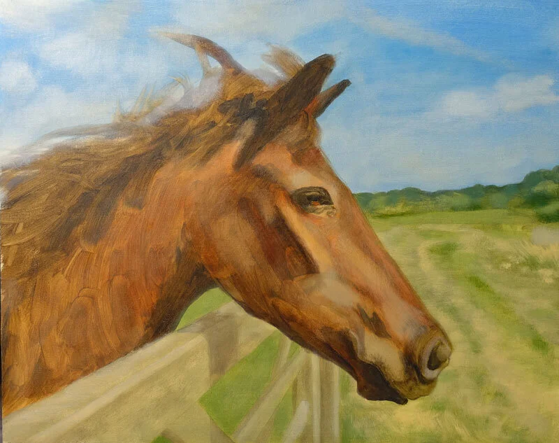
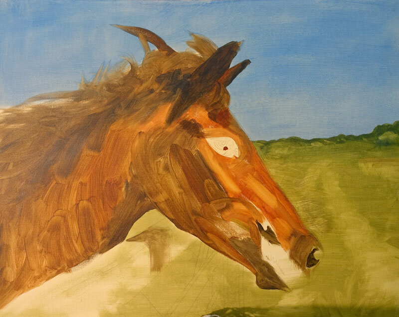
This Christmas commission has been started in oil paint on a Belle Arti fine cotton board, size 40 x 50cm. I use Winsor & Newton Alkyd Oils as they are faster drying, and I mix the colours with a little Zest-it in the under painting. So the first picture is of the drawing with its first layer of blocked in colour. I played around with the composition and cropping of the photo to make sure it would balance before sketching it onto the canvas board and then applying the paint with a large brush. After letting this layer dry overnight I started to work on putting in the darker tones to sculpt the bone structure and shape the muzzle. I also like to paint the eye early on in the painting so I can work with the character of the horse. A little more detail was painted into the background and the gate and clouds scumbled into the sky. In picture 3 you can see the shadow areas have been darkened - I use burnt umber with prussian blue to get some lively dark hues into the mane, on the neck, eyes, ears, nose, mouth and shadow areas. About halfway through the painting I chose to paint with smaller brushes. This is because I needed to hatch in a number of different hues to give Brandy a rich coat… indian red was used in pic 4 when lighter colours like naples yellow and titanium white mixed with some of the other browns were painted in tiny flecks to create more form in the sunlit areas. In the last two posts I deepened the shadows using ultramarine blue, cobalt violet hue and burnt umber before balancing the final hues and tones with burnt sienna and mixes of white.


Bruno - Boxer Dog in Acrylic

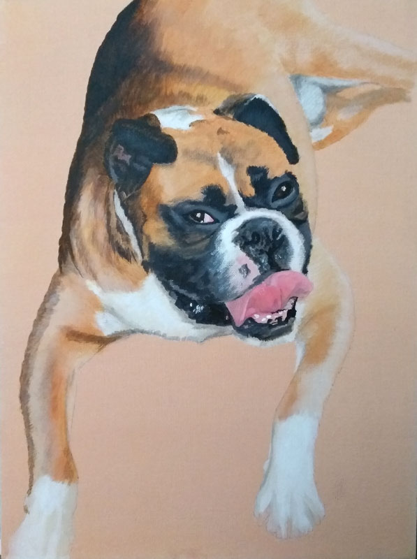


This painting of Bruno has taken a while to complete due to house moves - both myself and Bruno’s owners! It is to sit with a similar portrait I did of another Boxer of theirs called Rosie back in 2015 so firstly I had to remember which type of canvas surface I was using back then. Then I composed the portrait, taken from a very different angle, so that Bruno’s head is a similar size to Rosie’s. I painted the background the colour I remembered using and transposed the drawing over the top before blocking in light and dark areas of tone and specific colours, like the pink of the tongue. I have actually evolved the way I paint over the last few years so it has been a fun challenge to recall the process in order to keep the portraits looking similar. I have made sure to always paint in the direction of the fur, even in the early stages. After blocking in the main tones and hues, I changed my brushes to get smaller and hairier to build up texture in the fur. Many colours are painted in dashed layers - I have shown the yellow ochre and orange stage before finally toning everything down, ensuring the colours and tones balance and darkening any areas that needed attention. ‘Tis done!

In memory of Doris


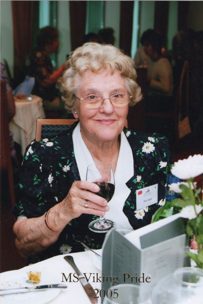


This portrait is of a lady I never met, but her husband has started coming along to my art classes and despite enjoying sketching and painting in watercolours and acrylics, wanted me to this portrait of his lovely wife, Doris, in pastels. Firstly I decided upon a warm grey pastel paper (Canson Mi-Tientes Touch) to match the frame and mount John gave me and cut it to size as the mount has an oval aperture. I sketched the outline of Doris and put in some base colours in white and cream. As the picture is quite detailed I chose to work with Faber-Castell pastel pencils from the outset and continued blocking-in rough areas of colour and tone without blending, This layering technique allows me to put texture into the painting to describe the facets of the face, direction of hair curls and freckles, which then get softened as more layers are applied. John suggested I paint her in a slightly different dress from another photo, which was one of her favourites, and also had a white daisy design and a larger white collar. The design is quite bold so I softened some of the leaves before balancing more of the lights and darks and adding a few more wispy hairs. As you can see from the other photos she looks a little different in each one so I hope I’ve captured her!

Belle - dog pastel portrait


This is Belle - a very beautiful little pooch, and she seems to know it! Her owners say she's a people-loving dog and very sensitive so I wanted to capture that from the pose. I painted another pet of theirs (Jazy) a few years ago posed on the same chair so I picked the same pastel paper to use again. I sketched Belle's outline before blocking in the dark areas with Conte pastels. Next I chose the lighter tones to block in followed by the midtones and bright orangey shades. I carefully blended them together to form a base on which to start applying stronger marks and details. These I did initially with the Conte pastels before moving onto using my favourite Faber-Castell Pitt Pastel pencils, blending a little less at each stage in order to retain the freshness of the marks. I used long, sweeping strokes on her ears and squiggly marks on the rest of her coat. Finally I incorporated some of the background buttons to tie it in with the previous portrait. I hope it works!!
Christmas commission in black & white


This Christmas commission is a detailed black and white sketch to use as a study for further paintings and shows the progression completed on Murano mid-grey A3 pastel paper. I started by creating some sketches to decide on the crop of the photo then with a few guidelines, started blocking in the white, blending with my finger to lose the texture of the paper and establishing the lightest areas. Next, I used a black Conte stick to map out the dark areas fairly swiftly but accurately. I blended roughly with my finger and overlapped some of the black onto the white to smooth out the skin tones taking care not to smudge the background. The features were added with more accuracy using a black Faber Castell pastel pencil before the whole portrait was carefully blended and adjusted with more white or black pastel to subtly deepen or lighten each area. The difference between the last three stages takes a lot longer than the first few stages - the changes are less dramatic and appear minimal but make a massive amount of difference to the expressions on the finished portrait.

Lady Lucy - Elizabethan cat portrait


This latest commission is a different take on your traditional cat portrait - the owner wanted 'Lady Lucy' portrayed as Elizabethan aristocracy as befits her pose! I started by making a number of sketches based on a few oil paintings. I painted a fine cotton canvas board with burnt sienna and sap green before making a detailed drawing of the ruff and the rest of the costume. I decided the ruff was the first place to start as that would place the head on the portrait. Once the ruff was filled in I started the underpainting of the cat's face and gradually built up the layers of fur to give a more 3-D effect. The pearls, jewels and gold took hours to paint to get them looking shiny and similar and I've left it all deliberately 'flat' to suit the style of that era of painting. The final touches... flicks of fur, a bit more detailing and those all-important whiskers!! Lady Lucy is ready to be framed and placed over an Elizabethan fireplace in time for Christmas.

King Charles Spaniel
This latest commission is in pastel and I chose a warm grey Pastelmat paper to sketch the basic outlines to start with. Next I blocked in the background colours and pushed the pastel pigments into the surface to create a 'dry' base before blocking in the dog's colouring with a variety of different pastel sticks ranging from the softer Daler Rowney and Unison ranges to the slightly harder Conte pastels. From there, as the picture is quite small and requires a lot of detail, I started making more defined marks with Pastel Pencils, gradually building up the colours and textures on the dog's coat and blending each layer. More layers and refinements were gradually made to shadow areas, markings, colours and tonal values, before finishing the background details and using sharpened pencils to add whiskers and fine fur details.


